Simon Context filter

The Context filter in Simon is a sophisticated filter that takes the previous filter’s input and match range to output some context around that filter’s output text.

It includes controls to specify the maximum number of characters before and/or after the matched range, and/or a delimiter before and/or after the matched range. So for example you can show up to 50 characters, stopping at a line break.

This filter is unusual in that it requires a previous filter to be used, and that needs to be either a Block– or Find-based filter, as those are the only ones that output the needed match range information.

The Context filter uses the Input specified in the test to determine which filter’s input and match variables to use: if you have two previous filters, you can make the Context filter look at the first one by choosing Filter1OutputText instead of the default FilterOutputText (which means the proceeding filter).

The match range is available in variables used by the Context filter, and can be used in your custom filters or notifiers if you wish:

  • {FilterMatchLocation}: the position of the match in the input text, e.g. the text between the Blocks, or the Find result. Note that the location is zero-based.
  • {FilterMatchLength}: The length of that match.
  • {FilterMatchEnd}: The location plus the length, for convenience.

You don’t need to worry about these variables for the Context filter, though; it uses them internally.

Here’s a simple example of this filter in action.

This is from a Web test that looks at the Daring Fireball site. It has a Find Required filter to look for the word “finally”, then if that succeeds a Context filter to output the enclosing paragraph. To round it out, if the Find filter fails, the Override as Unchanged failure case is used, to avoid the test resulting in a failure if Gruber hasn’t used the word “finally” recently.

Below the filters, you can see the Preview pane’s output, which you’ll notice includes the word “finally” towards the end.

Context filter

I hope this will be a useful filter for many of your tests. Simon is a powerful tool, with lots of other handy filters, services, and notifiers.
Time Out Dock icon and status item

Time Out has several handy options, some of them only available to current or past supporters, as a reward for helping improve the app.

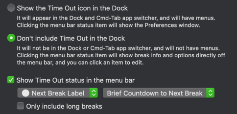
One such option is the ability to hide the app icon from the Dock. By default, the icon is shown there, for easy access, but if you want Time Out to operate more in the background, you can choose to remove the icon.

If you do so, the second option is automatically turned on: the checkbox to show a status item on the right-hand side of the menubar. This item has further options to choose what to include there.

General settings

The status item can optionally include a variation of the app icon, the label color of the next break, or neither:

General settings

It can also include a countdown to the next break, either in a compact form like “7m” for 7 minutes, or a wider form like “07:32”, for 7 minutes and 32 seconds. In the compact form, it only shows seconds when less than a minute. That’s my favorite form, to attract attention when getting close to a break.

Alternatively, the value can show the time when the next break is due, or will finish, or how long it is. Or no value, just an icon:

General settings

There’s a further checkbox to only show long breaks in the status item, i.e. don’t show ones with a duration of less than a minute.

A further useful tip about the status item is that if you hover over it, a tooltip will appear that lists when the upcoming breaks are next due:

General settings

When the Dock icon is shown, clicking the status item will bring Time Out to the front, to show the settings window. When the Dock icon is hidden, clicking it will display a menu-like popover of the sidebar, for quick background access to the breaks and options. Clicking one will expand to the full window.

You may wonder what happens if you hide both the Dock icon and the status item. The window will display a warning message:

General settings

As the message says, if you do this, you can still access the settings window, though it’s a bit harder. You would need to find Time Out in your Applications folder and double-click it to make it active. Since the Dock is hidden, it won’t show a menu bar, so there isn’t a visual indication that it is active, but you can press ⌘, (i.e. Command and Comma together), which is the keyboard shortcut for the Settings window, to show it.

Some people like doing this, to discourage changing settings, but most people should show either the Dock icon or status item, or both.

Time Out fixed image and blog themes

I got a support request for Time Out, my popular break reminder tool, asking to display a fixed image during the break.

Time Out uses HTML pages as break themes, so it is possible to have a fixed image as a theme — in fact the default theme, Icon, does just that, with the app icon.

So one way to have a fixed image is to:

  1. Choose the Reveal Themes command at the end of the Theme pop-up menu to open the Themes folder in the Finder.
  2. Duplicate the Icon theme folder and give it a new name.
  3. Replace the icon.png file with your chosen image.
  4. Edit the index.html to adjust the name and size of the displayed image.
  5. Edit the Info.json file to give the new theme a unique identifier etc.
  6. Pretty easy. You can edit those files in TextEdit or any other text editor.

If the image is available on some website, it’s actually a little easier. I have created an example theme on the Time Out extras page:

Download the Ducks & Fish theme

You can edit a copy of this theme to use a different image:

  1. Choose the Reveal Themes command at the end of the Theme pop-up menu to open the Themes folder in the Finder.
  2. Add the Ducks & Fish theme, if not already.
  3. Duplicate that theme and give it a new name.
  4. Edit the Info.json file to give the new theme a unique identifier, and change the URL to the desired image.

(This got me thinking, and I spent an hour or so writing up notes on ways to make adding image-based themes even easier in a future version. I’m always trying to improve the app.)

While I was at it, I also added four themes to display my four blogs; these are all included with Time Out by default:

  • Dejal Blog: a theme that simply shows the Dejal blog, so you can read it during your break, to see the latest news about Time Out and other Dejal apps (doesn’t update very often, though, so probably not that exciting for a regular break).
  • Dejus Blog: a theme that shows my personal blog, where I post photos and comments every day. Could be good for a short break a once or twice a day.
  • Sinclair Trails Blog: a theme to show the Sinclair Trails blog, about my travels around the US in a motorhome, including photos and timelapse videos of driving days, photos of places we stay, and of attractions we visit.
  • Yellow Cottage Blog: a theme to show the retired Yellow Cottage Homestead blog, about the chickens, ducks, feral cats, bees, and other homestead topics of my former homestead. Could be good for a lunchtime break.

If you try those, you might want to set the Opacity to 100% on the Break Appearance page.

Time Out isn’t a web browser or feed reader, but since the themes are just web pages, these show some of the interesting things you can do.